
Redesigning a legacy platform to reduce friction
- 27 de out. de 2024
- 3 min de leitura
Atualizado: 17 de abr.
Company: Rota Soluções
B2B fleet management platform
My Role
I was the sole Product Designer on this project, allocated for 6 months to restructure a legacy B2B platform. I was responsible for the full design process — from discovery and user research to interaction design, stakeholder alignment, and handoff. I also led the design of new features developed after the initial redesign.
Context
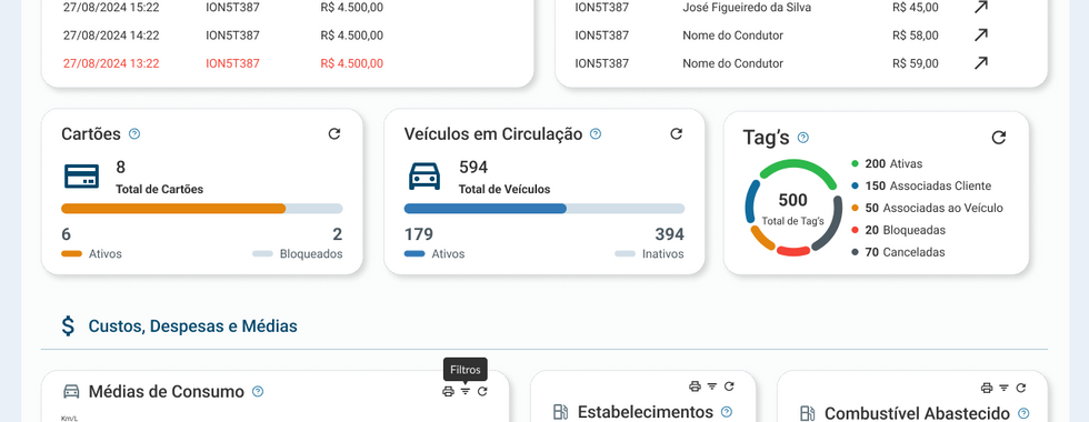
Rota Soluções is a B2B platform used by companies to manage their vehicle fleets. The primary users were fleet administrators, responsible for monitoring vehicles, accessing operational data, and supporting decision-making for logistics and management teams.
When I joined the project, the platform already existed and was considered a legacy system. Despite offering a wide range of features, it suffered from poor usability, slow performance, and an interface that made everyday tasks unnecessarily difficult.
I worked as the sole Product Designer, responsible for restructuring the system with a strong focus on usability, clarity, and cleaner design, while collaborating closely with product leadership and stakeholders.
The problem
Although the platform was functionally complete, its complexity was poorly communicated through the interface.
As a result:
Users spent excessive time completing routine tasks
Critical information was hard to find or interpret
Frustration affected both users and internal teams
The core issue was not the lack of features — it was the way complex information and business rules were presented, making decision-making harder instead of easier.
Discovery
To understand the problem, I conducted user interviews with fleet administrators, analyzed usage data through Google Analytics, and held ongoing conversations with the product director and internal stakeholders.
One key insight emerged early and shifted the entire direction of the project:
The system already had the necessary functionality. The main source of frustration was how information was structured and exposed — not what the system could do.
This reframed the challenge from adding features to simplifying flows and improving clarity.
Process
The platform involved dense operational information, complex business rules, and multiple stakeholder perspectives.
To organize this complexity, I:
Created personas to support both design decisions and internal alignment
Mapped usage flows to understand how users navigated the system
Used wireframes as discussion tools with stakeholders
Conducted usability testing to validate assumptions across iterations
This process made it clear that the main challenge was presenting a high volume of critical information in a way that felt manageable and intuitive — despite technical and business constraints.


Decisions and trade-offs
One of the most challenging aspects of the project was driving alignment around the need for change.
Stakeholders were initially resistant, given the system’s legacy nature and existing workflows. To support decision-making, I relied on:
user interview insights
market benchmarking
mediation through data-driven conversations
Balancing business expectations with user needs required prioritizing simplification, even when it meant revisiting long-standing patterns.

Outcomes and impact
10 out of 10 users interviewed after the redesign reported improved usability and task resolution
30% increase in platform usage within 6 months, measured through Google Analytics
Users reported that the new interface supported clearer and more confident decision-making
The redesign created a foundation for new features, which I also led the design of
Learnings
This project reinforced the importance of simplifying complex information without oversimplifying the problem.
Working on a legacy system taught me that design impact often comes from clarity and structure — not from adding more. The moment I stopped asking "what's missing?" and started asking "what's getting in the way?" the project found its direction.
It also reinforced that evidence is the most effective tool for organizational alignment. Data and user voices move stakeholders faster than design opinions alone.
